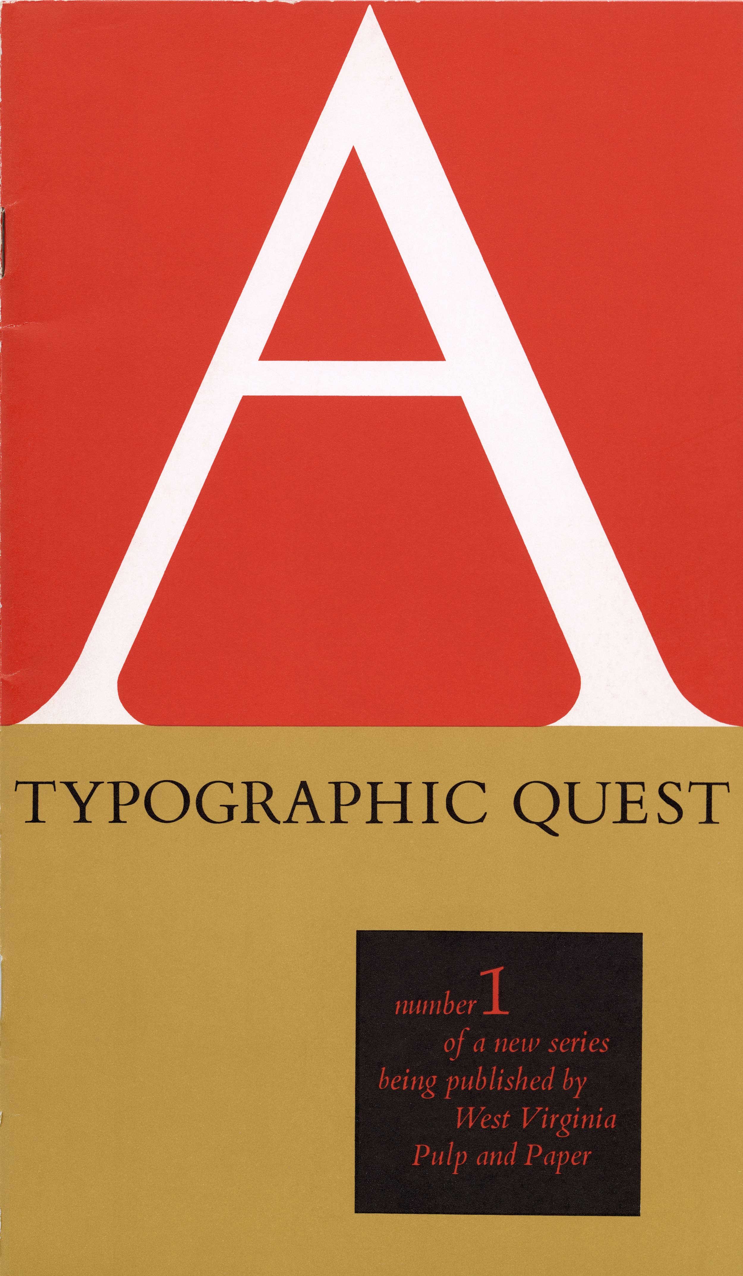
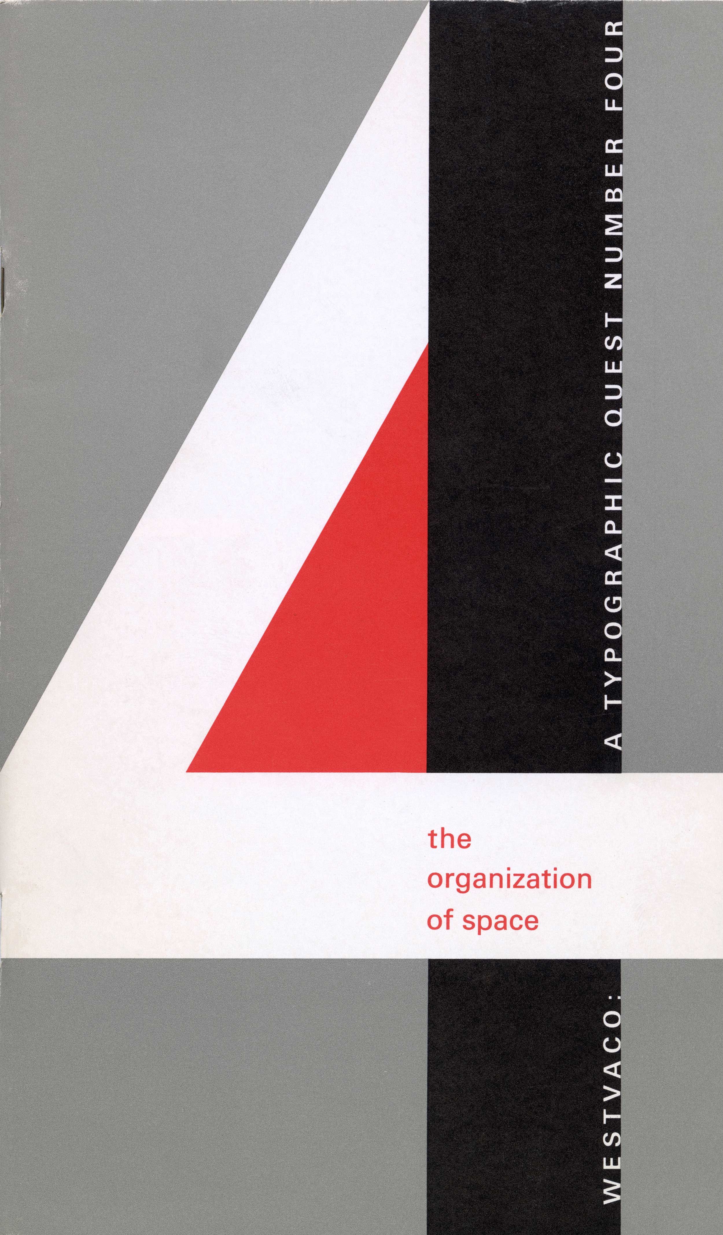
Display Types, A Typographic Quest, Number Two – Westvaco, Carl Dair, 1965
Notes
After examining the fundamentals of typography in the first issue of A Typographic Quest, it was perhaps only natural that Carl Dair should focus on display types in the second issue. Generally speaking, display types are the first typefaces people see. The ability to attract attention is an important component of most display faces, whereas it has little place in text types. That is also why in the early years of advertising many headlines were hand lettered.
Dair begins by asking what makes a typeface a display face: is it size, ornamentation, contrast or something else? Starting with the decorative initials that were used to indicate new paragraphs in a 15th century German Blackletter setting, he looks at how those initials evolved into the almost mindless explosion of ornate and decorative types of the 19th century. The rapid growth of advertising in the 19th century was largely responsible for the rise of display types. Other topics he examines are the use of text faces for display, creating a ‘typographic image’ and the larger question of what is considered appropriate typographic display. In 28 pages Dair provides what may be one of the best introductions to display types ever written. – Rod McDonald
Artifact Text
Typographic Display
All printed matter requires a focal point which marks the beginnings of the message. This unit, whether it be the quiet title page of a book or a screaming headline in a sale advertisement, is considered by the printer and typographer to be the ‘display’ matter. Obviously, each piece of text is an individual problem, and the more original the solution of the display, the more effective it will be. However, there are certain techniques which are valid for all types of display, and this second edition of Typographic Quests undertakes to analyze these various techniques in the hopes that it will provide a stimulus to the better use of type for display.
-
Category
PublicationsTitle
'Display', A Typographic Quest, Number TwoDate
1965Publisher
West Virginia Pulp and Paper CompanyCredits
Design: Carl Dair (1912–1967)
Author: Carl DairPrincipal Typefaces
Cover: Univers Bold, hand-lettered ‘Q’ and ‘2’
Text: Caledonia, Standard (Akzidenz Grotesk), variousDescription
Booklet, 28 pp
Size: 5.25 × 9 inchesRegions
OntarioLanguages
EnglishNumber of images
3Holding
Canadian Typography Archives -
Artifact copyright: CTA was unable to clarify rights but welcomes contact from rightsholders to resolve permissions, if required, and will remove digitized works at the rightsholder’s request (rightsholders may contact CTA at copyright@canadiantypography.ca). CTA makes digitized works available for education and research. Responsibility for any use rests with the user.
Notes copyright: Notes accompanying artifacts are licenced under Creative Commons licensing CCbyNC which allows for non-commercial use with attribute.
You might also like:
A Typographic Quest – Number One, Westvaco, Carl Dair, 1964
Type to be Read – A Typographic Quest, Number Three, Westvaco, Carl Dair, 1965
The Organization of Space – A Typographic Quest, Number Four, Westvaco, Carl Dair, 1966
If you have any information about this work or those who contributed to it, or about any similar work that you would be willing to share, we invite you to contact us.
Please contact us at: info@canadiantypography.ca
⚠️ Do you have something to add? Did we get something wrong? Did we miss crediting someone? Please Submit an Edit to suggest a correction, or add to this artifact. Your contribution is important to us. Thank you in advance.


