Type to be Read, A Typographic Quest, Number Three – Westvaco, Carl Dair, 1965
The background on the cover of booklet number three is from a page printed by George Herolt of Rome, in 1481. The title is set in Palatino Italic, with swash caps, and Palatino small caps. Dair placed a stylized caret over a circle to create an eye, the often forgotten tool in reading.
In three sample settings Dair demonstrates how the length of a line of type affects our ability to read. If the line is too long for the size of type, we simply lose track of how to get back to the next line. Likewise, if the lines are too short, the constant shifting back and forth can quickly become tiresome. In both cases if the reader does not what the problem is they may simply lose interest and stop reading.
Using his Alphacast system, Dair explains how to calculate the number of pages a specific typeface will occupy. This was basic information that all typographers, and many designers, had to know before they could order typesetting. To aid typographers, the type foundries used to provide tables that showed how many characters would fit in a line of type.
In Dair’s words; “The Alphacast is a simplified method of estimating how much space a typewritten manuscript will occupy when set in any given size and style of type. All that is needed is a specimen alphabet from a to z of the type to be used.”
Notes
In issue three, Type to be Read, Carl Dair looks at text types. Typically, text faces are tasked with doing the bulk of the work on most projects. Dair maintained that, unlike display faces, style is not always the most important consideration when choosing a text face. Rather, it is how that typeface is set and arranged on the page that will largely determine whether a person can, or will, read the text. He lays out the basic rules on how to set a block of text to ensure that the reader can read it – without too much difficulty. Regardless of whether it is a bothersome sales brochure or potentially life-saving instructions, if a person has trouble reading the text they are not going to ‘get’ the message. It is a basic cause of ‘a failure to communicate’.
Also included in this issue is a prototype of the Alphacast, a system that Dair developed to aid designers in calculating how much space typewritten copy will occupy when set in a specific style and size of a typeface. Before computer typesetting, and the use of layout software, designers had to know exactly how many pages a typewritten manuscript would occupy when set in a specific typeface. The text, often called ‘copy’, had to go through a number of crucial steps before it could be sent out for typesetting. Designers had to know certain fundamental things; the size, leading and line length of a typeface before they could order the typesetting. Dair had planned on marketing the Alphacast but died before it was ready. – Rod McDonald
Artifact Text
A brief excerpt from Chapter 5, The sizes of type:
“The selection of the proper size of type is of critical importance for easy reading, and this will vary with the audience in respect to age, education, and condition of eyesight. There are no fixed rules, but certainly a book for a child just learning to read should not be set smaller than an 18-point type, nor should an educated adult of average vision be expected to cope with any great length of text set in less than 8-point.”
-
Category
PublicationsTitle
Type to be Read, A Typographic Quest, Number ThreeDate
1965Publisher
West Virginia Pulp and Paper CompanyCredits
Design: Carl Dair (1912–1967)
Author: Carl DairPrincipal Typefaces
Cover: Palatino Display Italic, Palatino Regular and Small Caps (Linotype)
Text: American Garamond, American Garamond Italic (Monotype), variousDescription
Booklet, 28 pp
Size: 5.25 × 9 inchesRegions
OntarioLanguages
EnglishNumber of images
5Holding
Canadian Typography Archives -
Artifact copyright: CTA was unable to clarify rights but welcomes contact from rightsholders to resolve permissions, if required, and will remove digitized works at the rightsholder’s request (rightsholders may contact CTA at copyright@canadiantypography.ca). CTA makes digitized works available for education and research. Responsibility for any use rests with the user.
Notes copyright: Notes accompanying artifacts are licenced under Creative Commons licensing CCbyNC which allows for non-commercial use with attribute.
You might also like:
Display – A Typographic Quest, Number Two, Westvaco, Carl Dair, 1965
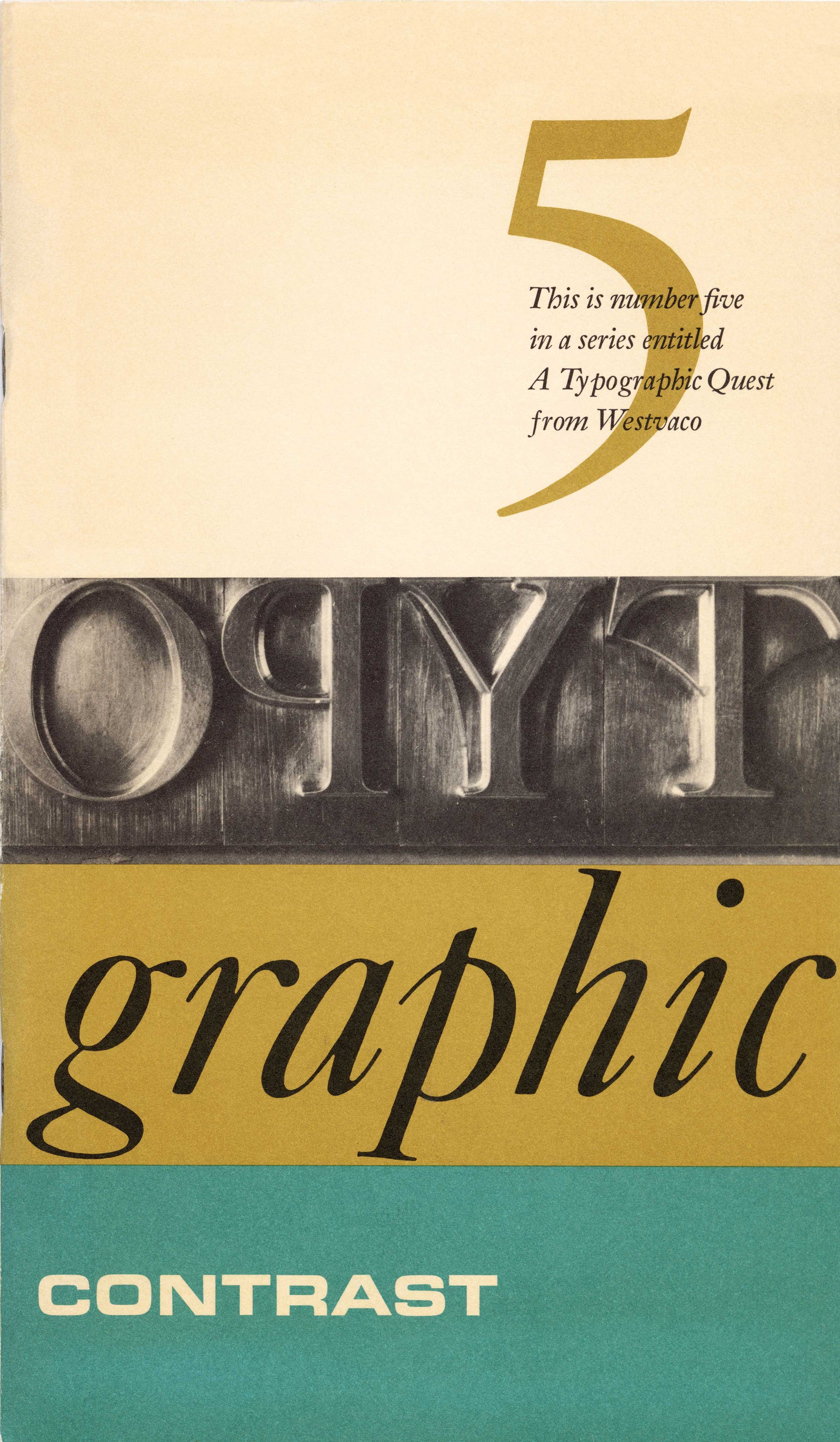
Typographic Contrast – A Typographic Quest, Number Five, Westvaco, Carl Dair, 1965
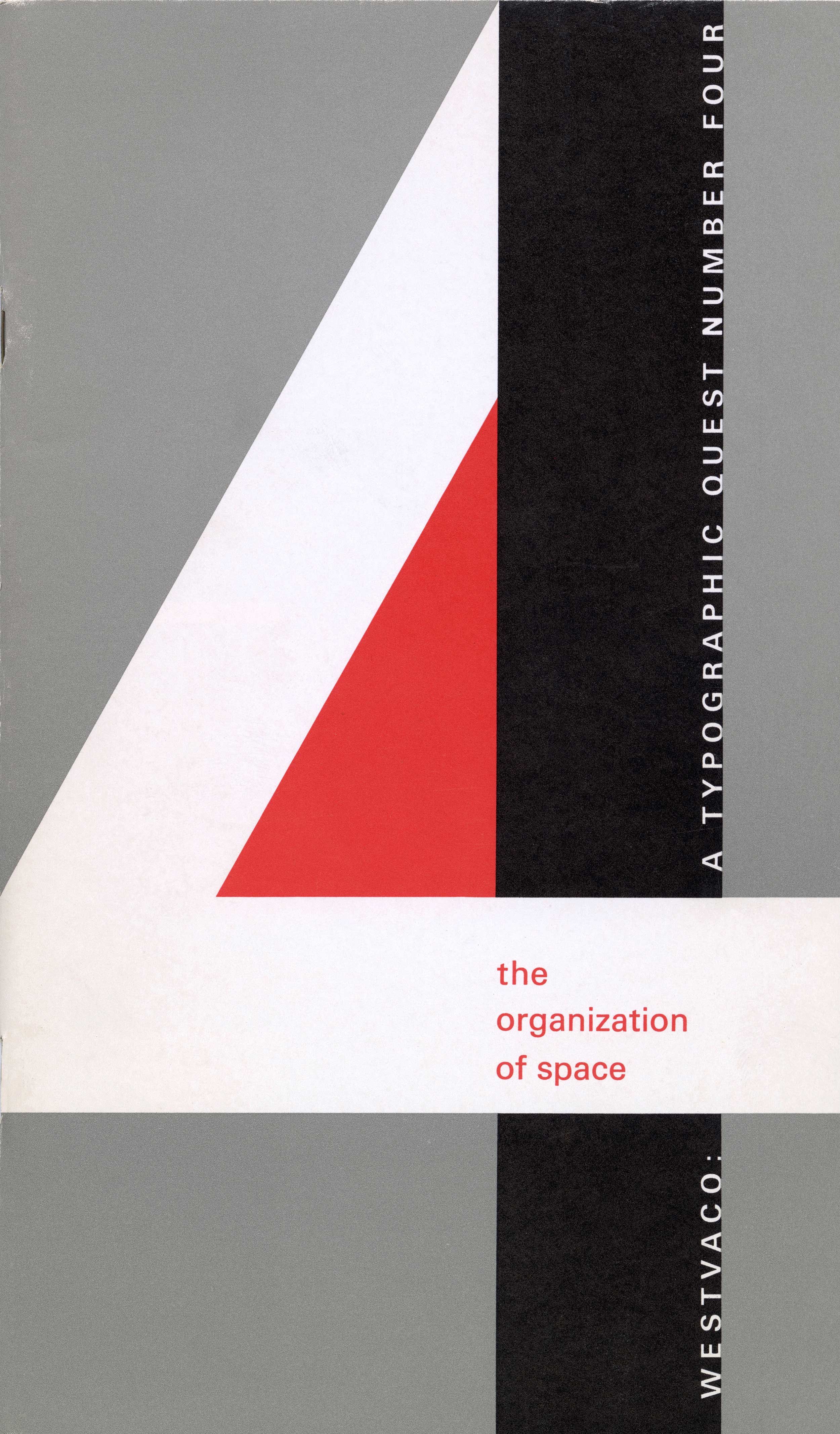
The Organization of Space – A Typographic Quest, Number Four, Westvaco, Carl Dair, 1966
If you have any information about this work or those who contributed to it, or about any similar work that you would be willing to share, we invite you to contact us.
Please contact us at: info@canadiantypography.ca
⚠️ Do you have something to add? Did we get something wrong? Did we miss crediting someone? Please Submit an Edit to suggest a correction, or add to this artifact. Your contribution is important to us. Thank you in advance.


