A Typographic Quest, Number One – Westvaco, Carl Dair, 1964
Notes
Between 1956 and 1962, the American designer Bradbury Thompson had been responsible for the hugely popular Westvaco Inspirations for Printers. In 1964 Carl Dair begin a new series for Westvaco called A Typographic Quest. In many ways Dair was the obvious choice to follow Thompson. He had an international reputation, and in addition to being an accomplished designer and writer, he also knew the paper business.
Working for a much larger company brought with it a correspondingly larger budget that allowed Dair to reprise his role as a typographic design educator. Within three short years he wrote and designed six informative booklets on typography which, like the five booklets he had earlier produced for The E. B. Eddy Paper Company, would also be used as textbooks.
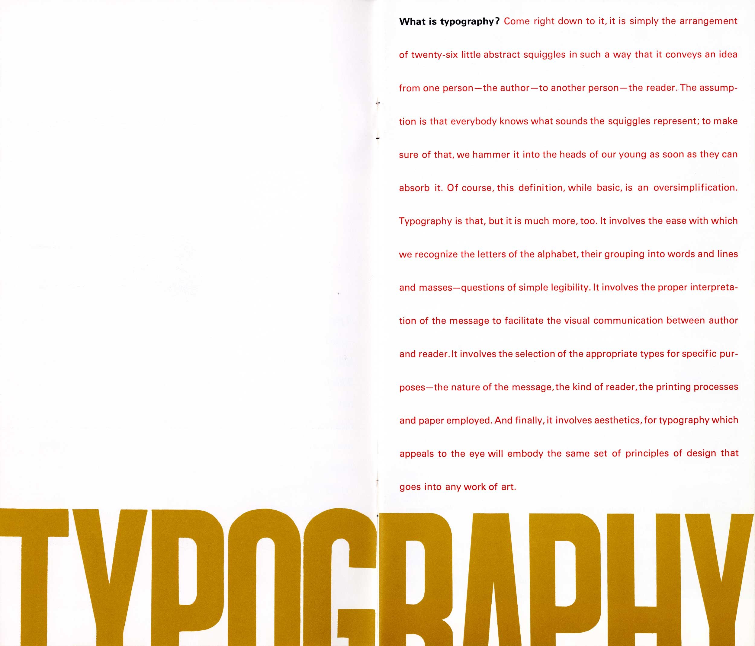
The title of the first Issue, A Typographic Quest, also served as the title for the series; it could be argued that it is also an apt description of Dair’s life. A brief quotation from his introduction to this first issue sets the stage for the entire series: “A piece of fine printing is a combination of many things and many skills — good typesetting, good presswork, good paper and good design, all carefully interwoven to achieve the one objective of appealing to the reader. This fellow has no eye for the details of technological perfection. All he can see is what strikes his eye in the initial visual impact — the design of the piece. Without good design, the most meticulous typesetting and presswork and the most luxurious paper are all wasted. That is our justification for taking our friends, printers, designers and buyers of printing, on this typographic quest.” Apart from a few references to technology, and the prevailing assumption that the reader will be male, Dair’s words are still relevant today. – Rod McDonlad
-
Category
PublicationsTitle
A Typographic Quest, number oneDate
1964Publisher
West Virginia Pulp and Paper CompanyCredits
Design: Carl Dair (1912–1967)
Author: Carl DairPrincipal Typefaces
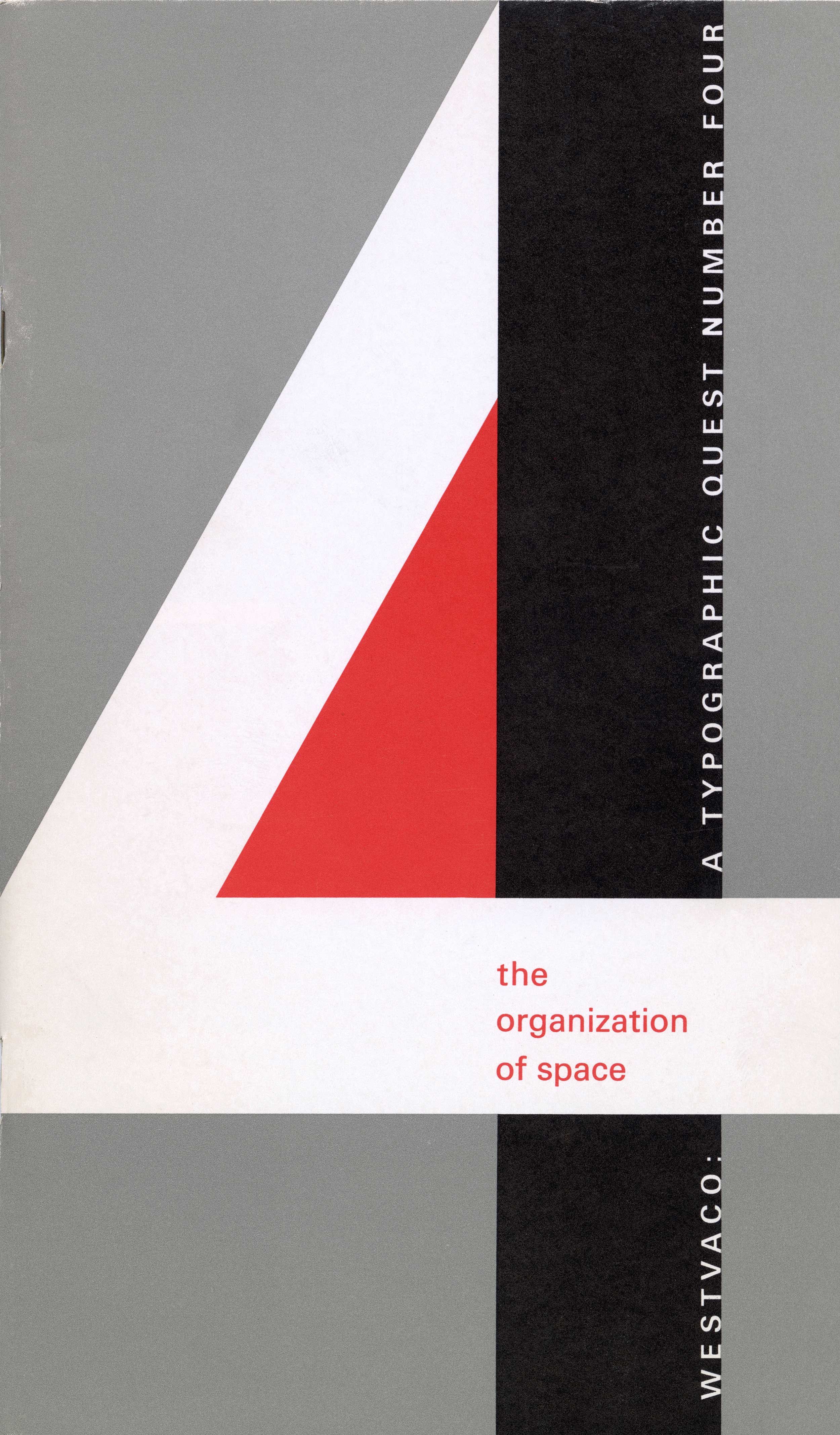
Cover: hand-lettered Roman ‘A’, Bembo Caps, Bembo Italic, Palatino ‘1’
Title Page/Spine: Univers (Monotype)
Text: Bembo, various
Envelope: Mercator Bold (?), Standard Regular (Akzidenz Grotesk)Description
Booklet, 28 pp
Size: 5.25 × 9 inchesRegions
OntarioLanguages
EnglishNumber of images
4Holding
Canadian Typography Archives -
Artifact copyright: CTA was unable to clarify rights but welcomes contact from rightsholders to resolve permissions, if required, and will remove digitized works at the rightsholder’s request (rightsholders may contact CTA at copyright@canadiantypography.ca). CTA makes digitized works available for education and research. Responsibility for any use rests with the user.
Notes copyright: Notes accompanying artifacts are licenced under Creative Commons licensing CCbyNC which allows for non-commercial use with attribute.
You might also like:
Display – A Typographic Quest, Number Two, Westvaco, Carl Dair, 1965
Type to be Read – A Typographic Quest, Number Three, Westvaco, Carl Dair, 1965
The Organization of Space – A Typographic Quest, Number Four, Westvaco, Carl Dair, 1966
If you have any information about this work or those who contributed to it, or about any similar work that you would be willing to share, we invite you to contact us.
Please contact us at: info@canadiantypography.ca
⚠️ Do you have something to add? Did we get something wrong? Did we miss crediting someone? Please Submit an Edit to suggest a correction, or add to this artifact. Your contribution is important to us. Thank you in advance.


