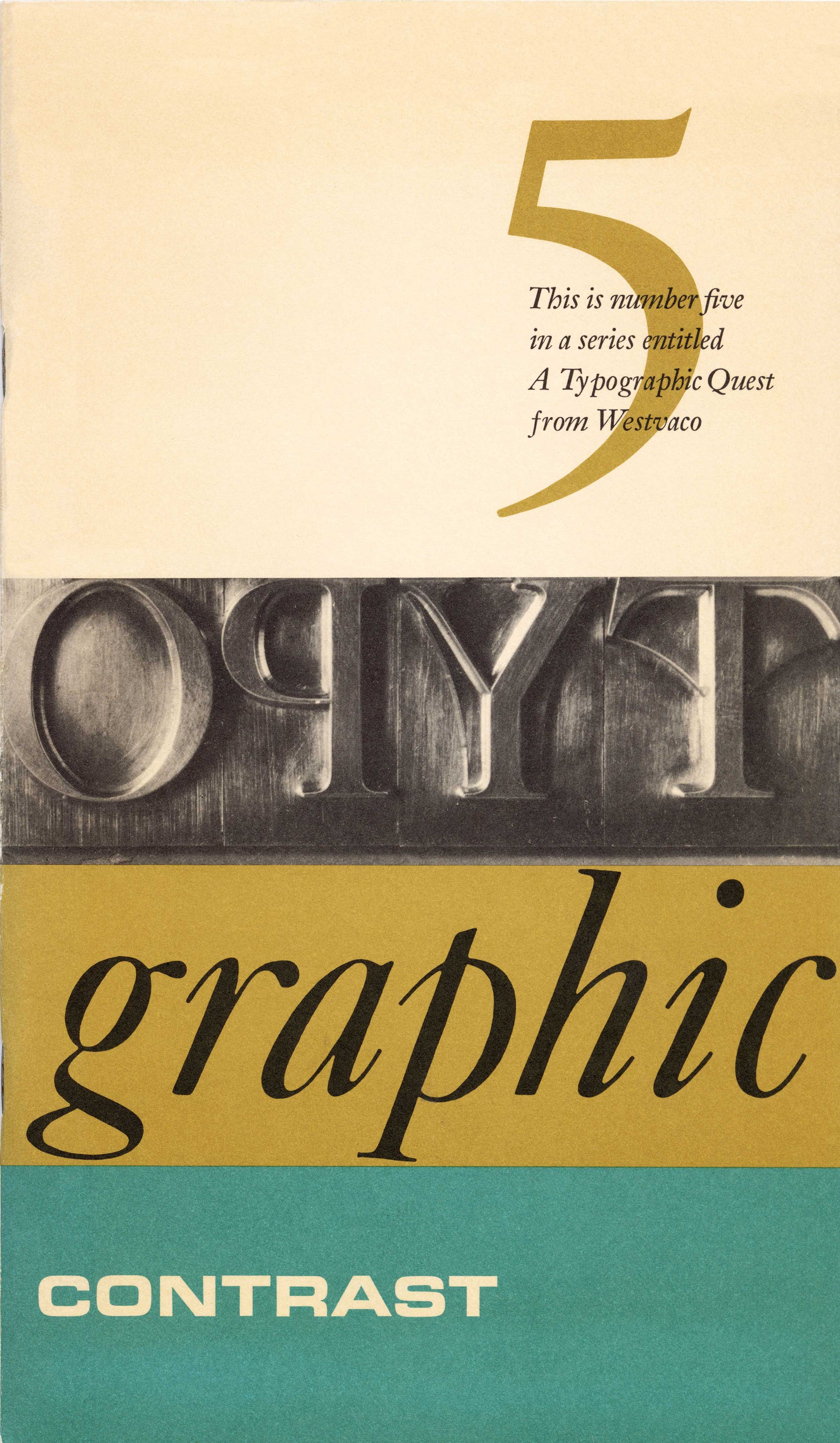
The Organization of Space, A Typographic Quest, Number Four – Westvaco, Carl Dair, 1966
Using a basic sub-division of space, Carl Dair produced an exceptionally strong cover for the fourth issue of A Typographic Quest. He deliberately chose Univers, an unobtrusive neo-grotesk typeface that did not compete with the space he had created.
Using a translucent tracing paper overlay, Dair creates a dynamic double-page spread. He separates the inner and outer shapes of a letterform to reveal the abstract space around both elements. In order to see that space when drawing letters, type designers would work back and forth on both sides of the tracing paper.
When the red background shape is overlapped on top of the two black counter shapes the form of the letter ‘g’ is clearly apparent. Dair cleverly demonstrates that the shape of a letter is determined as much by the space surrounding it as it is by the strokes used to form it. Type designers consider both the inner and the outer shapes to be of equal importance.
Notes
Carl Dair was very conscious of space in typography. Both editions of his book Design with Type even had a chapter devoted to it. His attitude regarding the role of space in design can be summed up in two brief quotations from this booklet; ”Space is meaningless until something happens within it; when there is a ‘happening,’ whatever it may be, the space becomes articulated and can communicate to the viewer.” He then goes on to say; “All the visual arts are involved in the problems of articulating space.” For Dair, the choice of typeface, its size and even colour, may all be compromised if any one of those elements are not properly placed in that space we call a page. The deep awareness of space that so many typographers possess can be traced back to the early punch-cutters, followed later by type designers (which Dair also was). For them space is not something passive, it is an active ground that helps to define the shape of a letter, and that has never been better illustrated than in this little booklet.
In 1966 The Organization of Space was chosen as one of the best direct mail pieces in the United States. Dair received the award in September 1967. – Rod McDonald
-
Category
PublicationsTitle
The Organization of Space, A Typographic Quest, Number FourDate
1966Publisher
West Virginia Pulp and Paper CompanyCredits
Design: Carl Dair (1912–1967)
Author: Carl DairPrincipal Typefaces
Cover: Univers 55 (Monotype)
Text: Univers 55, News Gothic, variousDescription
Booklet, 26 pp
Size: 5.25 × 9 inchesRegions
OntarioLanguages
EnglishNumber of images
3Holding
Canadian Typography Archives -
Artifact copyright: CTA was unable to clarify rights but welcomes contact from rightsholders to resolve permissions, if required, and will remove digitized works at the rightsholder’s request (rightsholders may contact CTA at copyright@canadiantypography.ca). CTA makes digitized works available for education and research. Responsibility for any use rests with the user.
Notes copyright: Notes accompanying artifacts are licenced under Creative Commons licensing CCbyNC which allows for non-commercial use with attribute.
You might also like:
etcetera – A Typographic Quest, Number Six, Westvaco, Carl Dair, 1968
Type to be Read – A Typographic Quest, Number Three, Westvaco, Carl Dair, 1965
The Organization of Space – A Typographic Quest, Number Five, Westvaco, Carl Dair, 1966
If you have any information about this work or those who contributed to it, or about any similar work that you would be willing to share, we invite you to contact us.
Please contact us at: info@canadiantypography.ca
⚠️ Do you have something to add? Did we get something wrong? Did we miss crediting someone? Please Submit an Edit to suggest a correction, or add to this artifact. Your contribution is important to us. Thank you in advance.


