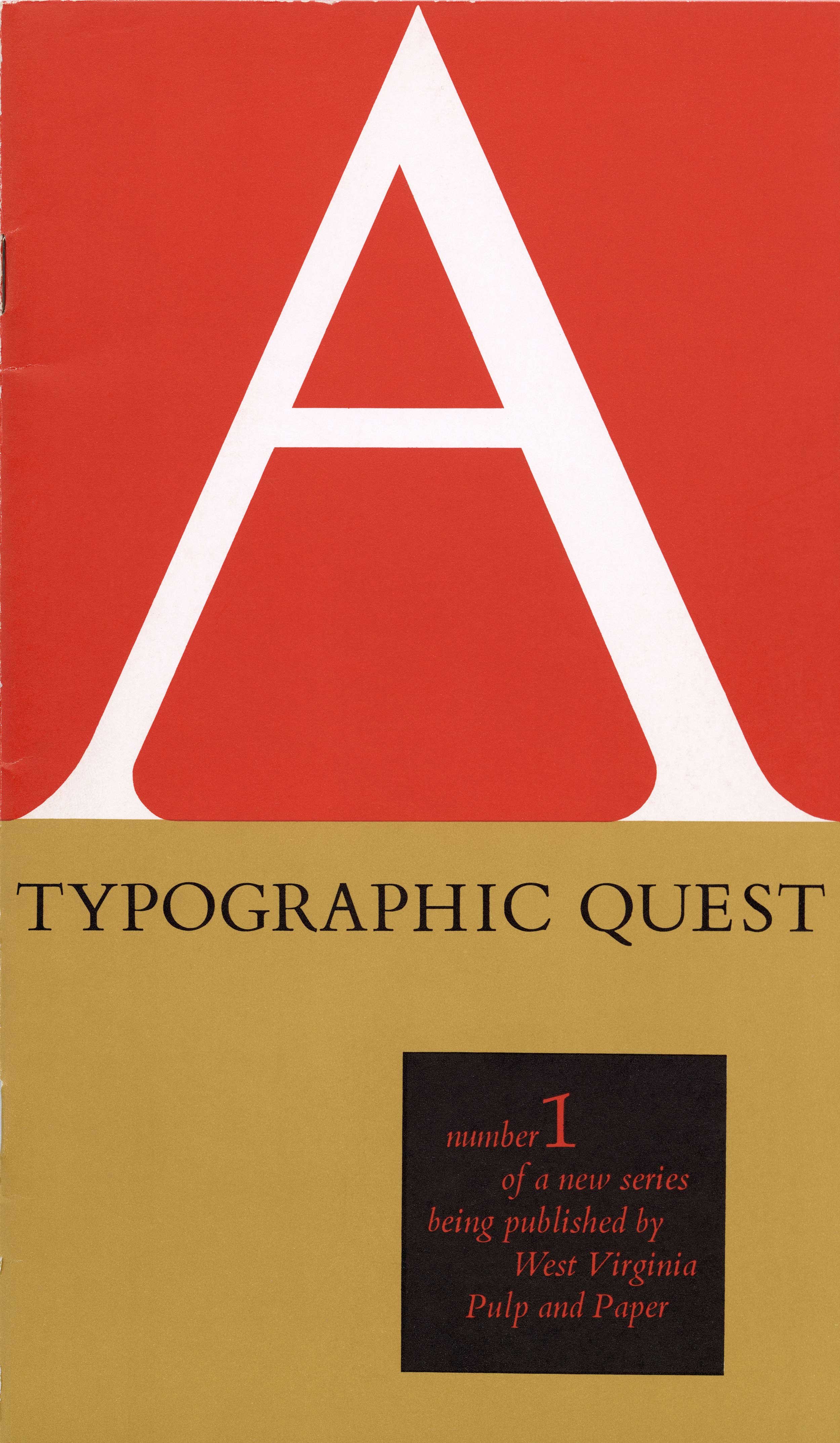
Typographic Contrast, A Typographic Quest, Number Five – Westvaco, Carl Dair, 1967
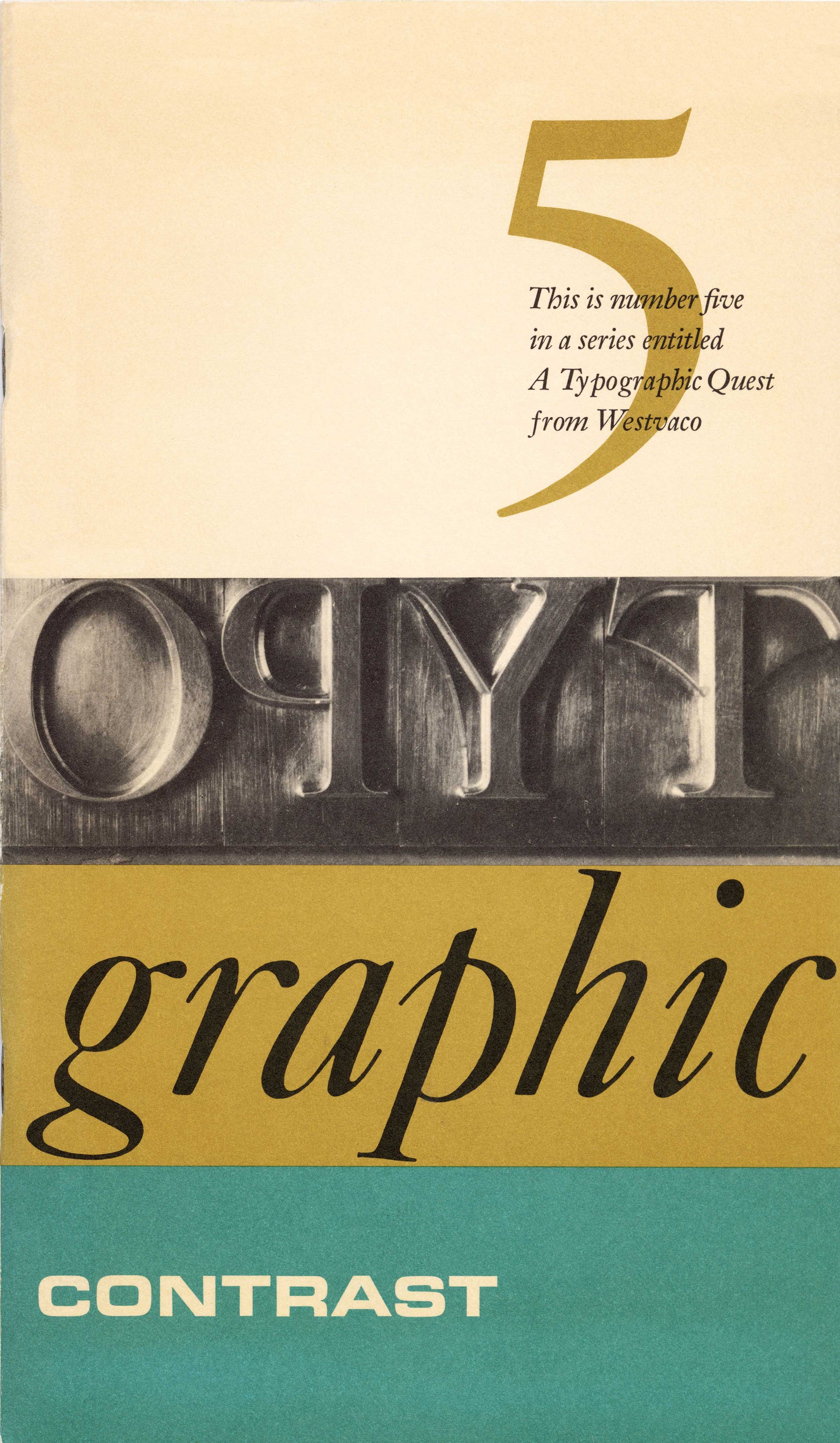
On this cover Carl Dair uses five elements to clearly demonstrate contrast in typography. The ‘5’ is Cloister Old Style Italic, the sub-title that overprints the ‘5’ is Original Janson Italic, the photo of the metal type is Caslon Old Style, ‘graphic’ is set in Caslon Italic and ‘contrast’ is Eurostile.
Dair used clippings from various sources to illustrate texture in typography, which he describes as, “the rich and endless varieties of textures which can be created from the types in everyday use. Like threads in cloth, types form the fabric of our daily communication.”
Dair explores how the language of music can be applied to the visual medium of typography. On this spread he demonstrates how the ‘interrupted rhythm’ of early jazz musicians can be applied to design. Note the deliberate, irregular line endings in the column of text.
Notes
In the fifth booklet in the series Carl Dair examines the various forms of contrast in typography. He begins by comparing typography with music, noting that typography can often express the same kinds of moods and harmonies as musical compositions. Dair even suggests that one can guess a designers’ taste in music by the nature of their design. He briefly compares designers with composers, a subject that has also been explored by others.
Leaving music, Dair moves on to look at how to achieve typographic contrast using; size, weight, form, structure, texture, colour and direction. He also explores non-typographic contrast, such as isolating elements and choosing the right paper. Coming full circle, he returns to his music analogy beginning with the ‘typographic notes’ (letters), followed by the ‘chords’ (the combination of two or more contrasts), and ‘rhythm’ (intervals of space).
In some respects, this may be the strongest volume in the series. Dair’s arguments are well thought out and clearly illustrated. His musical metaphors ring true regardless if you are a ‘classical’ or ‘pop’ typographer. – Rod McDonald
-
Category
PublicationsTitle
Typographic Contrast, A Typographic Quest, Number FiveDate
1967Publisher
West Virginia Pulp and Paper CompanyCredits
Design: Carl Dair (1912–1967)
Author: Carl DairPrincipal Typefaces
Cover: Cloister Old Style Italic ‘5’, Caslon Old Style metal caps (photo), Caslon Italic (graphic), Eurostile (contrast), Original Janson Italic (sub title)
Text: VariousDescription
Booklet, 32 pp
Size: 5.25 × 9 inchesRegions
OntarioLanguages
EnglishNumber of images
3Holding
Canadian Typography Archives -
Artifact copyright: CTA was unable to clarify rights but welcomes contact from rightsholders to resolve permissions, if required, and will remove digitized works at the rightsholder’s request (rightsholders may contact CTA at copyright@canadiantypography.ca). CTA makes digitized works available for education and research. Responsibility for any use rests with the user.
Notes copyright: Notes accompanying artifacts are licenced under Creative Commons licensing CCbyNC which allows for non-commercial use with attribute.
You might also like:
Display – A Typographic Quest, Number Two, Westvaco, Carl Dair, 1965
A Typographic Quest – Number One, Westvaco, Carl Dair, 1964
etcetera – A Typographic Quest, Number Six, Westvaco, Carl Dair, 1968
If you have any information about this work or those who contributed to it, or about any similar work that you would be willing to share, we invite you to contact us.
Please contact us at: info@canadiantypography.ca
⚠️ Do you have something to add? Did we get something wrong? Did we miss crediting someone? Please Submit an Edit to suggest a correction, or add to this artifact. Your contribution is important to us. Thank you in advance.


