etcetera, A Typographic Quest, Number Six – Westvaco, Carl Dair, 1968
Carl Dair repeats the title to create a grey square of never-ending typographic details that almost crush the word etcetera. Tight fitting lines like this were considerably easier to do in photo-typesetting than metal. The title is set in News Gothic Regular and Bold, the word etcetera is set in Univers 55.
Once the type is on the page or screen, the next step is to make sure that people can read it. Using many examples Dair shows how paying attention to details such as the proper fitting of cap initials and correcting bad line breaks, etc. helps ensure that the copy makes sense to the reader.
Complex text often requires multiple levels of headings, sub headings and other forms of emphasis, all of which today we generally refer to as hierarchy. Dair suggests that you start by carefully reading the copy itself which, if clearly understood, will guide the typographer in finding the best solution.
Notes
Edition number six, etcetera, is the last in the series A Typographic Quest and was published a few months after Carl Dair’s untimely death in September 1967. Etcetera simply means ‘and the rest‘. It is typically used to indicate that there are more items, often too numerous to mention, that should be included or considered. Dair likely chose the name because this edition deals largely with the many small tasks that, for some unknown reason, he called ‘joe jobs’. Today, instead of ‘joe jobs’, we would refer to them as those never-ending details that if handled properly, will transform an amateurish job into a professional one.
Important as all those details may be, Dair goes one step further to point out that if you should find that the original idea itself is not working, then rethink it, or even abandon it. He recommends not wasting time trying to ‘fix’ all those details if the original concept is flawed. Unfortunately, Dair neglects to mention that learning how to identify a concept that does not work is one of the most difficult things to learn! – Rod McDonald
-
Category
PublicationsTitle
etcetera , A Typographic Quest, Number SixDate
1968Publisher
West Virginia Pulp and Paper CompanyCredits
Design: Carl Dair (1912–1967)
Author: Carl DairPrincipal Typefaces
Cover: Univers 55, News Gothic Regular, News Gothic Bold
Text: Times New Roman, variousDescription
Booklet, 32 pp
Size: 5.25 × 9 inchesRegions
OntarioLanguages
EnglishNumber of images
3Holding
Canadian Typography Archives -
Artifact copyright: CTA was unable to clarify rights but welcomes contact from rightsholders to resolve permissions, if required, and will remove digitized works at the rightsholder’s request (rightsholders may contact CTA at copyright@canadiantypography.ca). CTA makes digitized works available for education and research. Responsibility for any use rests with the user.
Notes copyright: Notes accompanying artifacts are licenced under Creative Commons licensing CCbyNC which allows for non-commercial use with attribute.
You might also like:
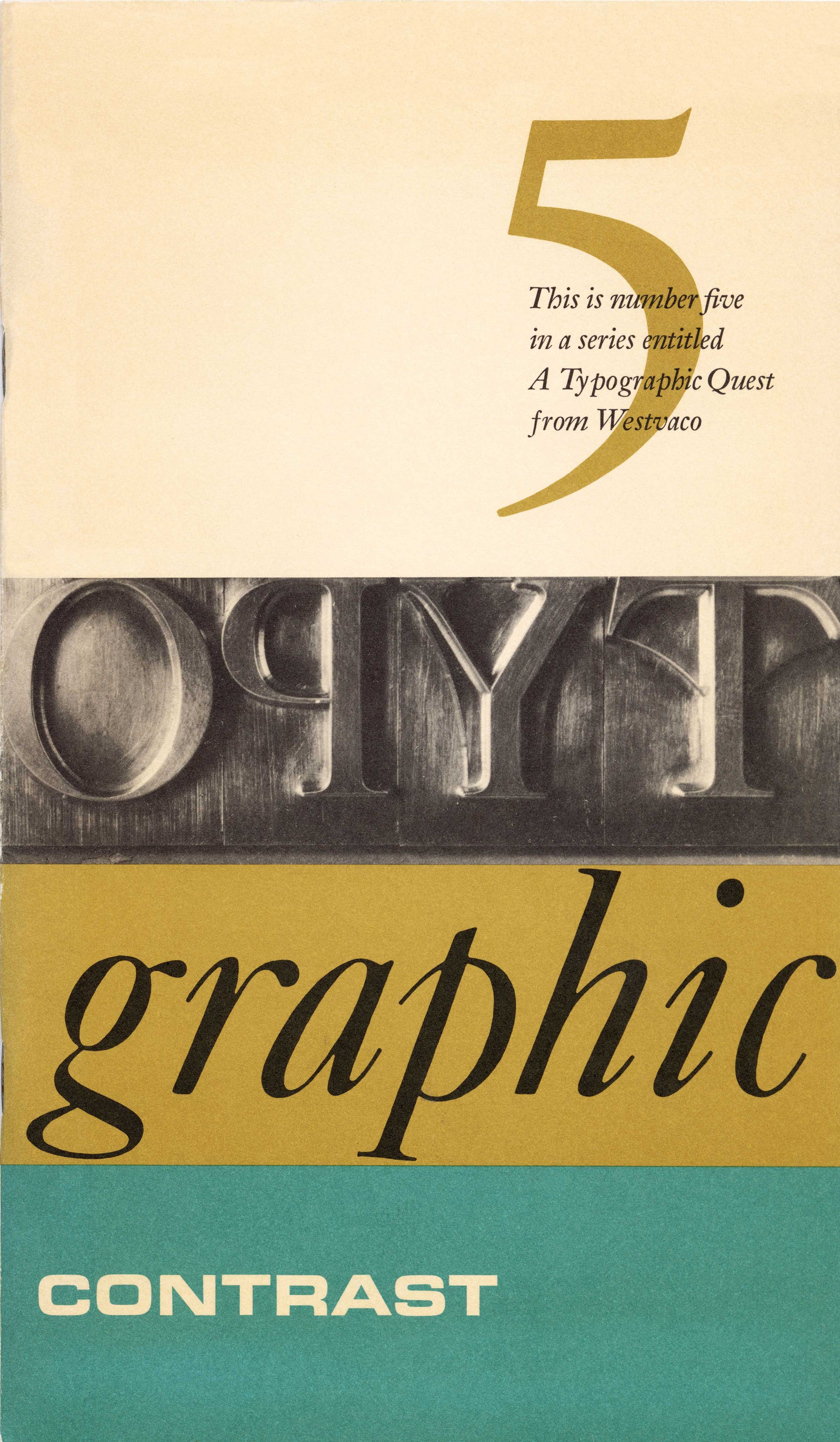
Typographic Contrast – A Typographic Quest, Number Five, Westvaco, Carl Dair, 1967
Type to be Read – A Typographic Quest, Number Three, Westvaco, Carl Dair, 1965
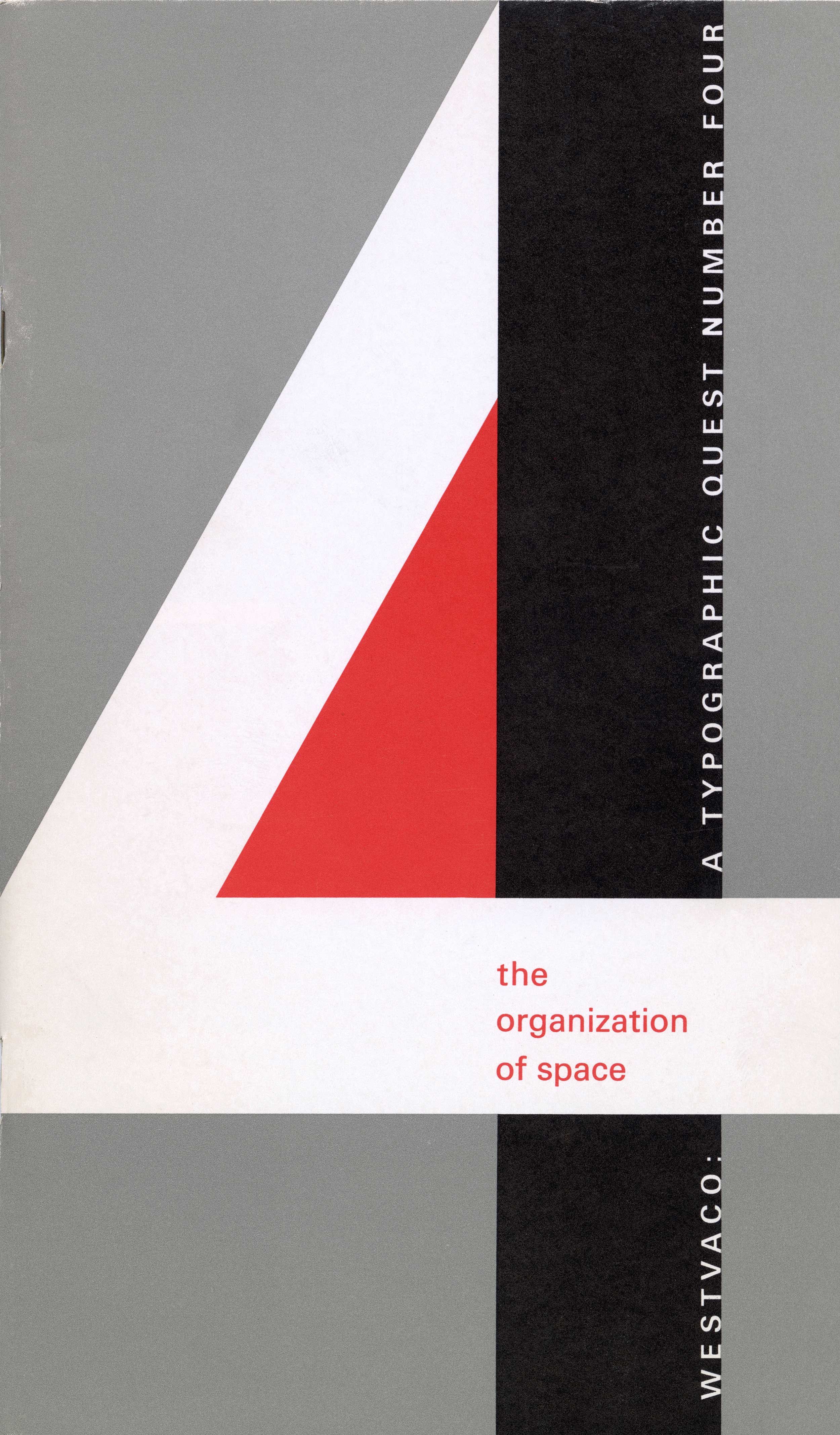
The Organization of Space – A Typographic Quest, Number Four, Westvaco, Carl Dair, 1966
If you have any information about this work or those who contributed to it, or about any similar work that you would be willing to share, we invite you to contact us.
Please contact us at: info@canadiantypography.ca
⚠️ Do you have something to add? Did we get something wrong? Did we miss crediting someone? Please Submit an Edit to suggest a correction, or add to this artifact. Your contribution is important to us. Thank you in advance.


