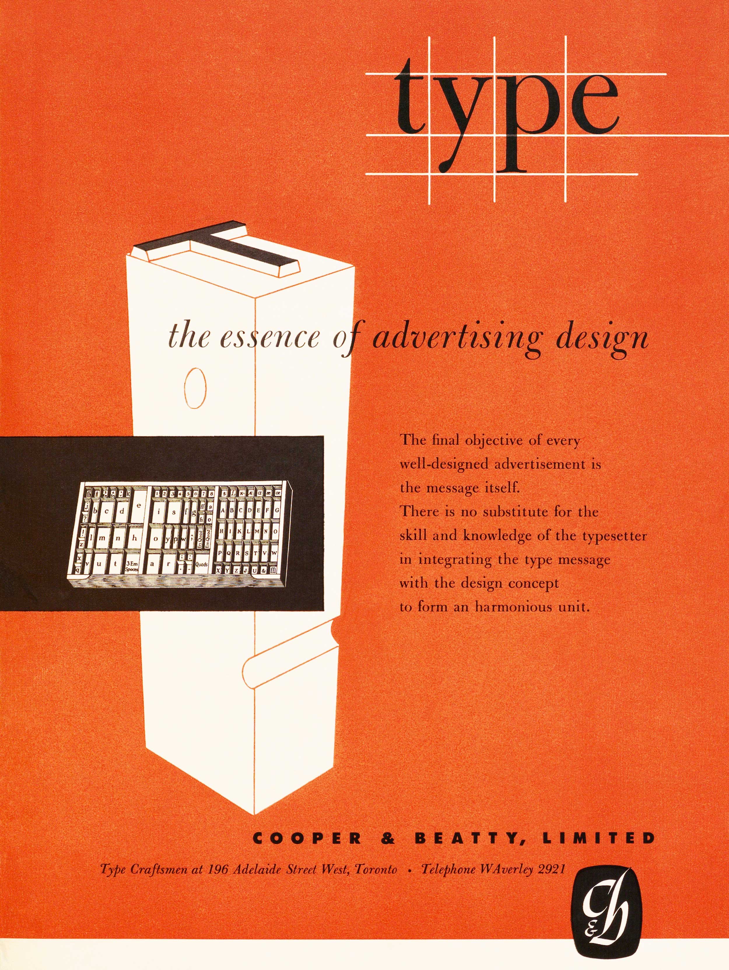
Type, the essence of advertising design – Cooper & Beatty, Carl Dair, 1951
The principal typeface is Bulmer, first produced by the punchcutter William Martin around 1790 for the Shakespeare Press run by William Bulmer. In 1925 American Type Founders (ATF) began work on a revival and in 1937 it would also be available from Lanston Monotype. Largely because of its similarity to Baskerville, Bulmer was a favourite of many 20th century typographers.
Notes
This is one of the first Cooper & Beatty ads to use the mark that Carl Dair designed for them in 1951. Dair had just moved from Montreal to Toronto. He bought a piece of land just north of Toronto, on which he built a house and a studio. His new company, Design Workshop Ltd., began with two clients; Cooper & Beatty and The E. B. Eddy Paper Company. Dair was still in Montreal in May of 1951, so it is reasonable to assume this ad was produced later that year. It would be another two years before C&B offered phototypesetting and their advertising was still focused on metal. Dair managed to convey three major steps in the manufacturing of metal type, starting with the drawing of the design, hinted at in the guidelines in the headline ’type’. He then shows a piece of metal type, and finally a type case containing the entire font. All would have been familiar objects to art directors, as would have been the idea that the message is the final objective of every ad. Jack Trevett is listed as the art director for this ad, that does not necessarily mean that he had any real involvement in the design – it just means that he was the president of the company. The careful placement of all the various elements in the ad show Dair’s superb control of space. This ad won an award in the Third Toronto Art Directors Annual show in 1952. – Rod McDonald
Artifact Text
Type, the essence of advertising design
The final objective of every well-designed advertisement is the message itself. There is no substitute for the skill and knowledge of the typesetter in integrating the type message with the design concept to form an harmonious unit.
COOPER & BEATTY, LIMITED
Type Craftsmen at 196 Adelaide Street West, Toronto • Telephone WAverley 2921
(mark)
-
Category
Advertising and PromotionTitle
Type, the essence of advertising designDate
1951Client
Cooper & Beatty, LimitedCredits
Art Direction: W. E. (Jack) Trevett (1905–1986)
Design: Carl Dair (1912–1967)Principal Typefaces
Bulmer Roman, Bulmer Italic, 20th Century (Futura)Description
Full-page two-colour print ad
Size: 8.25 × 11 inchesRegion
OntarioLanguage
EnglishNumber of images
1Holding
Canadian Typography Archives -
Artifact copyright: CTA was unable to clarify rights but welcomes contact from rightsholders to resolve permissions, if required, and will remove digitized works at the rightsholder’s request (rightsholders may contact CTA at copyright@canadiantypography.ca). CTA makes digitized works available for education and research. Responsibility for any use rests with the user.
Notes copyright: Notes accompanying artifacts are licenced under Creative Commons licensing CCbyNC which allows for non-commercial use with attribute.
You might also like:
dot on the i – Howarth & Smith Monotype, Carl Brett, 1959
Imagination is our third partner – Cooper & Beatty, Allan Fleming, 1958
Canadian Skill ad (1/6) – E. B. Eddy, Carl Dair, 1949
If you have any information about this work or those who contributed to it, or about any similar work that you would be willing to share, we invite you to contact us.
Please contact us at: info@canadiantypography.ca
⚠️ Do you have something to add? Did we get something wrong? Did we miss crediting someone? Please Submit an Edit to suggest a correction, or add to this artifact. Your contribution is important to us. Thank you in advance.


