The evolution of the four Cooper & Beatty trademarks – c1927 to 1964
The first Cooper & Beatty mark, c1927, designer unknown (possibly Ed Cooper). Some of the equipment in use at the time is shown in silhouette; a Monotype keyboard, a Monotype caster, a compositor standing at a typecase and a table for cutting strips of lead used for spacing.
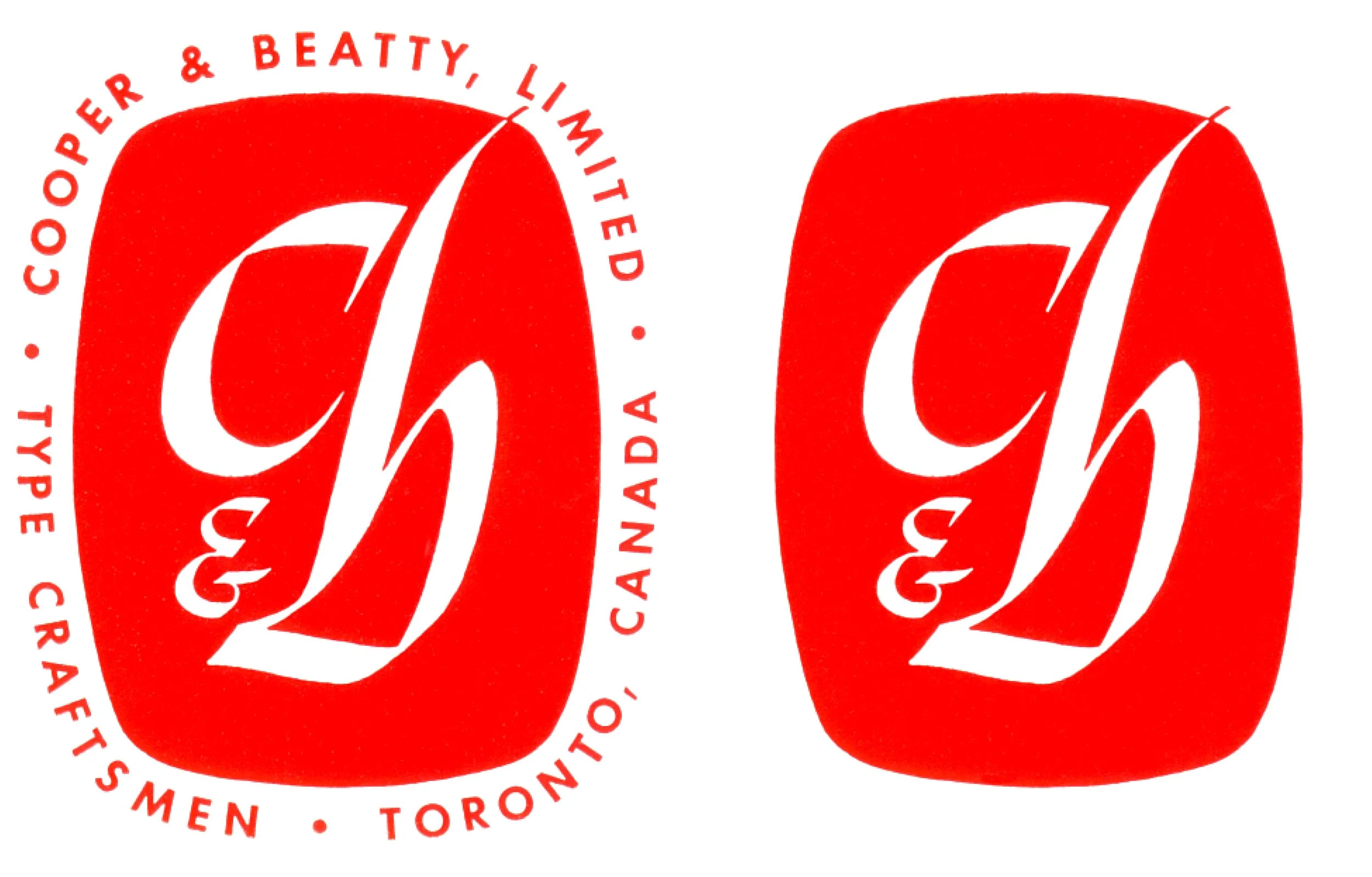
Carl Dair’s 1951 calligraphic mark, created using his own chancery cursive italic hand, was a radical departure from the first Cooper & Beatty mark. The version on the left was soon replaced with the mark without the explanatory text around it.
In early 1958 Allan Fleming reworked Dair’s calligraphic mark to make it more typographic. Fleming himself used the mark sparingly, even leaving it off some of their advertising. But on his 1958 Type-o-file type specimen box it was prominently displayed in a vivid orange.
Tony Mann’s 1964 circular mark may be the best known of the four Cooper & Beatty marks. The abstract C + B, far removed from standard alphabetic forms, made it possible to combine this mark with almost any typeface.
Notes
Throughout its roughly 75 years of operation Cooper & Beatty had four trademarks. The first one appeared around 1927 and remained in use until 1951. We do not know who created that first mark but it may have been Ed Cooper as he appears to have been responsible for C&B’s advertising and promotional material. Early typesetters worked mainly with other trades, primarily printers and engravers, and only rarely dealt with the general public. Later those trade typesetters added advertising agencies, public relations firms and graphic designers to their client list. Beginning in the hot-metal era the purchasing agents for those businesses would often base their purchasing decisions on the equipment in use in each type shop. Up to the last days of photo-typesetting most type shops still promoted the equipment they used.
In 1950 Ed Cooper and Lew Beatty sold the company to a small group of C&B employees led by Jack Trevett. In 1951 Trevett asked Carl Dair, then Canada’s foremost typographer, to design a new mark that would signal the recent change of ownership and lead the company in the burgeoning post-war years. Using his own somewhat idiosyncratic chancery italic hand, Dair created a unique calligraphic mark for the company. Initially the mark had explanatory text wrapped around it, but that was soon replaced with a simpler version without the text.
With business continuing to grow, in September 1957, Jack Trevett appointed a 28-year-old designer named Allan Fleming as Type Director (most likely on Dair’s recommendation). In early 1958 Fleming reworked Dair’s mark, largely by bringing a greater typographic discipline to the design. He altered the proportions of the ‘c’ and ‘b’ and added a cursive finishing stroke to the ascender of the ‘b’. He also replaced the calligraphic ‘&’ with a more conventional typographic roman (upright) design. Under Fleming’s guidance the studio turned out some remarkable promotional material that won an extraordinary number of awards in both Toronto and New York. The company were also holding exhibitions of the work of international designers in their fourth floor showroom. The invitations to those events were designed by Fleming who maintained a strict policy of never putting the C&B mark on any of those invitations. The international acclaim following the launch of the CN logo in 1960 raised Fleming’s reputation to a new level and in late 1962 he left C&B to pursue greater design opportunities.
Trevett then brought in British-born designer Anthony (Tony) Mann specifically to create a new corporate identity for the firm. Mann addressed a problem inherent in designing an identify for typesetting shops. If the letterforms used for the company mark are not radically different from the typefaces they are promoting there is a risk that the two letterforms will ‘clash’ visually. Mann’s design, introduced in February 1964, was an exceptionally strong mark that certainly did not conflict with any of the typefaces the company wished to promote. Its non-alphabetic design, based on medieval stone mason’s marks and resembling a Celtic cross, also signaled that C&B was now operating a graphic design studio. Nevertheless, the company remained committed to typesetting. In fact, only a few short years later they would largely abandon their venture into graphic design. But Mann’s circular orange mark would go on to become one of the most recognizable symbols in Toronto’s growing graphic arts scene. – Rod McDonald
-
Category
Graphic Design and BrandingTitle
The four Cooper & Beatty trademarksDate
c1927 to 1964Client
Cooper & Beatty, LimitedCredits
Design:
c1927 unknown
1951 Carl Dair
1958 Allan Fleming
1964 Anthony MannPrincipal Typefaces
All marks are hand-drawn. 1951 mark; 20th century (Futura)Region
OntarioLanguage
EnglishImages
4Holding
Canadian Typography Archives -
Artifact copyright: CTA was unable to clarify rights but welcomes contact from rightsholders to resolve permissions, if required, and will remove digitized works at the rightsholder’s request (rightsholders may contact CTA at copyright@canadiantypography.ca). CTA makes digitized works available for education and research. Responsibility for any use rests with the user.
Notes copyright: Notes accompanying artifacts are licenced under Creative Commons licensing CCbyNC which allows for non-commercial use with attribute.
If you have any information about this work or those who contributed to it, or about any similar work that you would be willing to share, we invite you to contact us.
Please contact us at: info@canadiantypography.ca
⚠️ Do you have something to add? Did we get something wrong? Did we miss crediting someone? Please Submit an Edit to suggest a correction, or add to this artifact. Your contribution is important to us. Thank you in advance.


