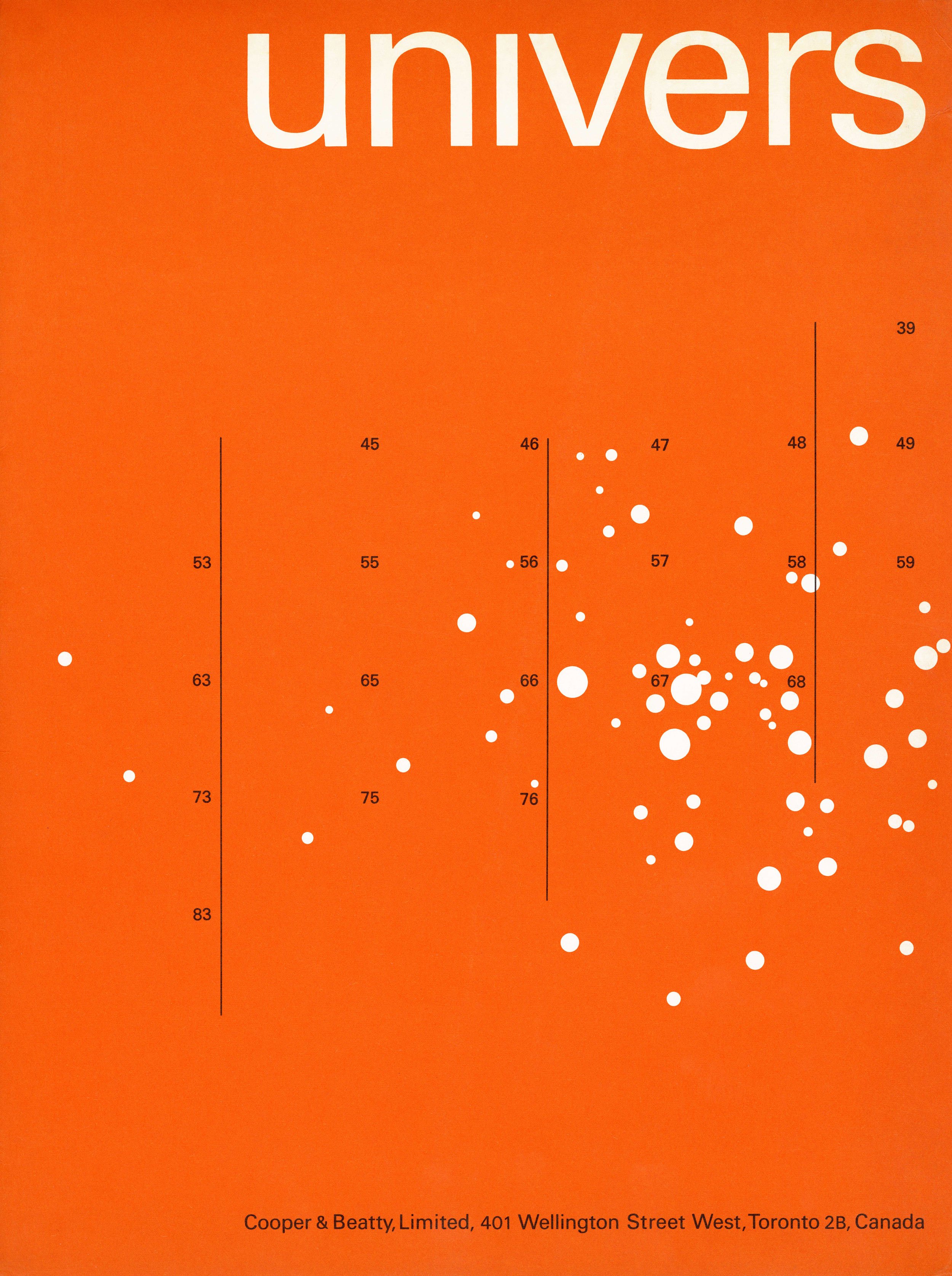
Monotype Univers type specimen – Cooper & Beatty, Tony Mann, c1963
Notes
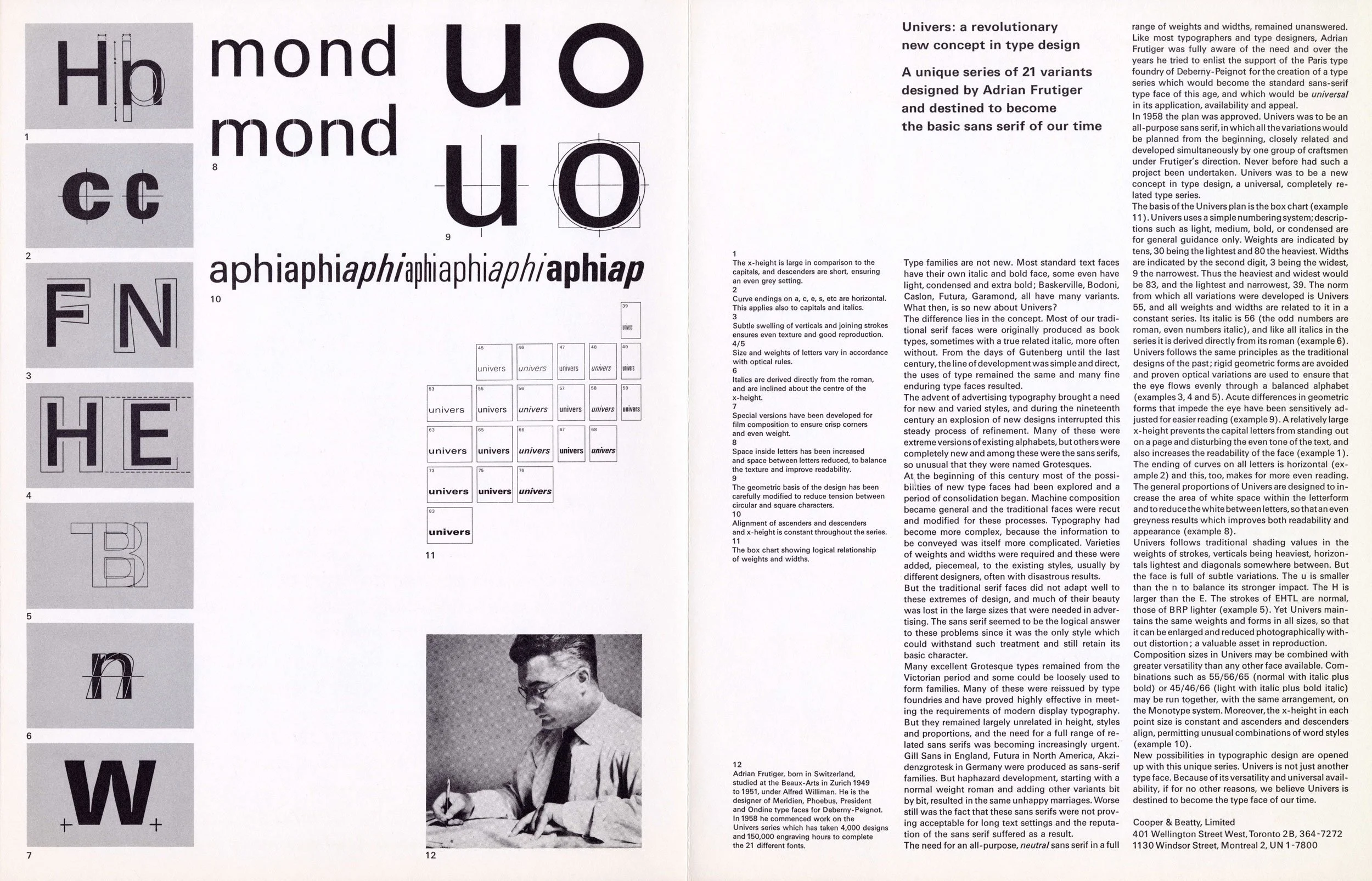
This folder of type specimens of the Univers family may be one of the earliest projects Tony Mann designed for Cooper & Beatty (C&B). The showings are of the eight Monotype hot-metal faces C&B had at that time (they did have the entire twenty-one font Univers family on other systems). The individual pages each show the eleven sizes of each typeface. In addition there is a folded 11 × 17 inch sheet with a large eighteen point showing of all eight typefaces on one side, on the other side is a detailed illustrated story about the design and development of the entire Univers family. The story is from an article in the January 1961 issue of the Swiss Printing Review, Typographischen Monatsblätter (TM). That entire issue was devoted to the Univers family. The same month an abridged version of the story also ran in Print, America’s Graphic Design Magazine. The logical design and systematic development of the Univers family was a major turning point in the design of typefaces. The in-depth article in TM was to have a similar effect on the marketing and promotion of typefaces.
The C&B fonds date this folder as being produced in 1966, but that may not be entirely accurate. The C&B mark does not appear anywhere on this piece, which is unusual as, with the exception of the invitations announcing visiting designers, C&B placed their mark on almost everything that went out of the shop. In February 1963 Tony Mann replaced Allan Fleming as Creative Director. Mann was to concentrate on creating a new image as well as developing a new overall design policy for the company. As a result all promotional material produced in 1963 did not use any mark. The old mark by Carl Dair, and revised by Allan Fleming in 1958, had already been retired. The new circular mark by Tony Mann was not revealed until early 1964 and from that point on appeared on everything. Less obvious, but equally important, Monotype fonts were expensive and the purchase of 88 fonts would have been a very large investment for C&B. It is doubtful that company President Jack Trevett would have waited three full years to promote such an important and expensive acquisition.
This folder is an unusually colourful example of the International Style of typography and it made a strong impression on Toronto designers. Even before his new mark or design policy for the company, Mann was already dramatically changing the look of Cooper & Beatty. However, despite the best efforts of the company to promote Univers, which they considered the better design, it would not be long before they too would have to admit the overwhelming popularity of Helvetica. But they never managed to produce anything for Helvetica that could equal this folder. – Rod McDonald
Artifact Text:
[from inside flap]
Cooper & Beatty, Limited
Univers is a planned series of type faces, designed and developed together in a logical sequence of weights and widths. The norm around which the family has been built is Univers 55. All variants in the series retain the same basic character, all have the same x-height and can be used together in the same word or line. The same true proportion is maintained throughout all sizes.
Identification of the fonts is by numbers. Weight of letter is graded from 30 to 80, width of letter is graded from 3 to 9, with even numbers denoting italics.
The C&B practice of using J and K to distinguish roman and italic will not be used for this series, but the letter U will preface the series number (U55, U56).
Since Univers was originally designed for the Didot system, some variation of casting sizes from different sources may be experienced, and attention is drawn to the standard sizing as followed by Cooper & Beatty, Limited. Univers is a unique type series. Its fine proportions, high readability and neutral character, combined with the flexibility within the series will, we believe, contribute to its future as the standard type series of our time.
-
Category
Advertising and PromotionTitle
Specimens of Monotype UniversDate
c1963Client
Cooper & Beatty, LimitedCredits
Design: Anthony (Tony) Mann (1927–2013)Principal Typefaces
Display: Univers (Monotype)
Text: Univers (Monotype)Description
Two-colour folder containing eight pages of type specimens
Size: eight pages, 8.5 × 11 inches; single double-sided page, 11 × 17 inches; folder, 9.25 × 12.5 inchesRegion
OntarioLanguages
EnglishNumber of images
5Holding
Canadian Typography Archives -
Artifact copyright: CTA was unable to clarify rights but welcomes contact from rightsholders to resolve permissions, if required, and will remove digitized works at the rightsholder’s request (rightsholders may contact CTA at copyright@canadiantypography.ca). CTA makes digitized works available for education and research. Responsibility for any use rests with the user.
Notes copyright: Notes accompanying artifacts are licenced under Creative Commons licensing CCbyNC which allows for non-commercial use with attribute.
You might also like:
Optima brochure – Cooper & Beatty, Tony Mann, 1963
Palatino – Cooper & Beatty, Jim Donoahue, 1960
Melure – the first Latin display alphabet designed in Canada, 1964
If you have any information about this work or those who contributed to it, or about any similar work that you would be willing to share, we invite you to contact us.
Please contact us at: info@canadiantypography.ca
⚠️ Do you have something to add? Did we get something wrong? Did we miss crediting someone? Please Submit an Edit to suggest a correction, or add to this artifact. Your contribution is important to us. Thank you in advance.


